
It's hardly a unique sentiment, but I really love music. From being introduced to The Miseducation of Lauryn Hill as a child to crying from joy as a teenager receiving Linkin Park's Hybrid Theory album, music has been a major part of my life for as long as I can remember. In high school, I was introduced to the Last.fm platform as a way to find new music, interact with other fans, and track my listening habits. I've continued to use the service to this day, resulting in a robust data set that tracks over a decade of my fandom.
Inspiration
This project bears a major debt to Andy Cotgreave’s work on Last.fm visualization, from his initial dashboard to the in-depth blog post detailing his work and methodology. Using the visualizations initially developed by Andy, I reconfigured them to fit my data and created a new multi-dashboard story to explore the findings.
Challenges
Similar Track Names
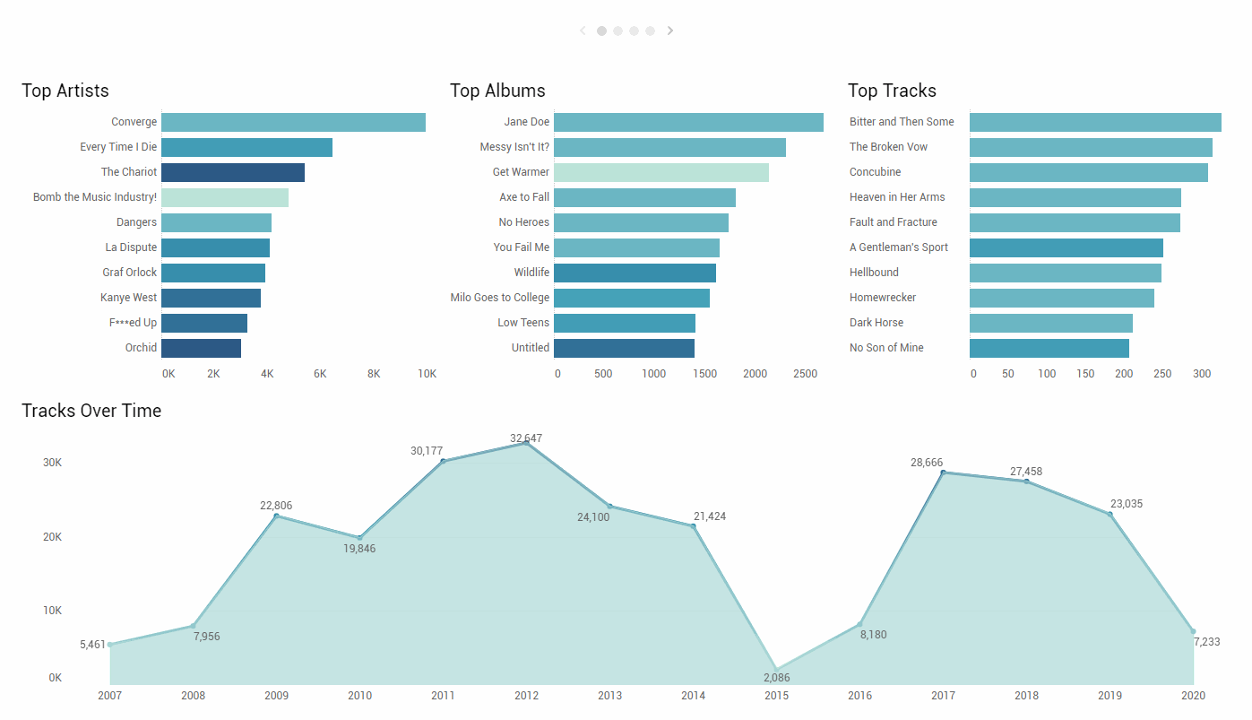
You would not believe the amount of artists of every genre who think it's really cool to have untitled songs and albums. It's a great choice for aesthetics, but it makes counting plays by track name challenging. And what about artists that include tracks with the same titles on multiple albums? Say a live album vs the original studio recording? I found the answer using a Calculated Field that combines the track title, album title, and artist name into a single field that can be used to identify unique tracks. Then, using some rearranging of the headers, I was able to include the original track names in the visualization.
Colors
One area that I can continue to work on is the colors. The blue and teal theme is great for look and feel, but doesn't really help to distinguish any of the various categorical variables. However, using all the colors in the rainbow doesn't help either. I believe the way forward lies in using parameters and sets to automate some of the formatting for the visualizations when they are interacted with. Stay tuned!
Highlights
Animation
In version 2020.1, Tableau introduced a new animation feature. I'd been waiting a while for this functionality, and it doesn't dissapoint. Getting a better sense of how the visualizations moves while updating is a wonderful gestural expression of the differences in the underlying data.
Example of the new animations feature added in Tableau 2020.1
Ultimately, this project was such a fun entry point into data visualization using Tableau. I am still using Last.fm to track my listening habits to this day and I will continue to refine this visualization just as I will continue listening to as much music as possible. Follow me on Last.fm and Tableau Public for more.